CSS3 Animations
MAIN OBJECTIVE
In this tutorial we will go over CSS3 animations, transformations, and transitions. We will discuss the different properties that are used for each and how they work together to enhance a web page.
SUB OBJECTIVES
- What are CSS3 Animations?
- Animating Objects
- Animation Properties.
- What are CSS3 Transforms?
- Transform Properties.
- What are CSS3 Transitions?
- Transition Properties.
PREREQUISITES
Before beginning this tutorial you should already have a strong understanding of HTML5 and CSS3 fundamentals and how to apply them to your web page. You should also have a firm grasp of how to properly style HTML elements using CSS3 best practices.
What are CSS3 Animations?
CSS Animations allow you to take normally static elements of a web page like, div's, h1's, spans, and animate them to add a little bit of style to your page. They work by animating the transition between two seperate css styles. CSS Animations are nice for a couple different reasons. They're easy to create and you don't have to know JavaScript in order to create them. They are quicker to run than other animations because the browser controls them and they don't have to be loaded from a seperate js file, because of this they usually run smoothly regardless of how much is loading in the background.
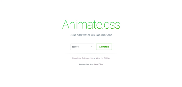
There is a really cool website out there called "ANIMATE.CSS". It allows you to select a variety of CSS3 animations from a drop down list. It will show you what each animation looks like and gives you the ability to see the code that makes it tick. You can check out this awesome resource by clicking the link above or on the screen shot below.
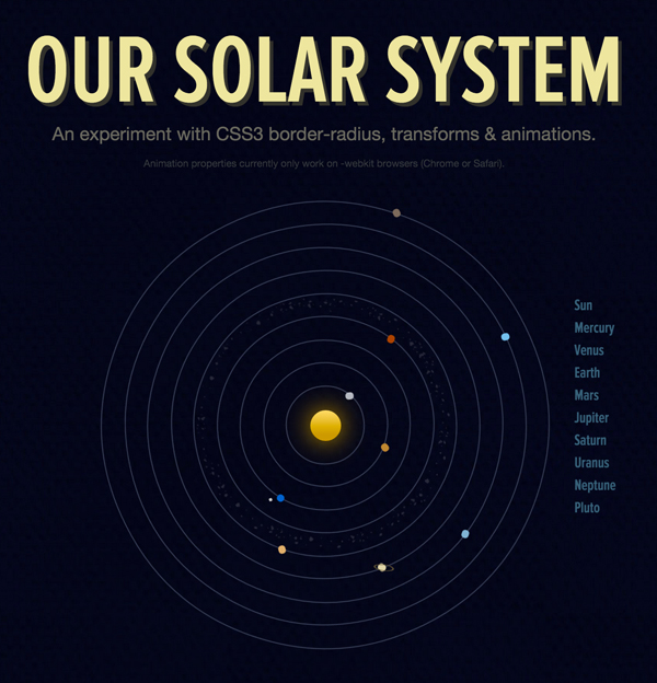
This Solar System is another really cool example of what you can do with CSS3 Animations.
Animation Properties
The properties tell the keyframe how to display animations as well as the timing of the animation and how to make them move. Below are a list of animation properties and what they do.
- animation-name: is just that. It tells you the name of the @keyframe animation.
- animation-duration: This is how long the animation will take to complete one complet cycle. The default is always 0 for this so you have to specify how many seconds or miliseconds you want your animation to run.
- animation-iteration-count: This is how many times the CSS animation will play. By default every animation is only set to play one time unless told otherwise.
- animation-delay: This is how long the browser will wait before it starts the animation. By default the delay is 0 seconds, but you can change this as needed.
- animation-direction: This tells the browser if the animation should play in reverse or not. The default is normal meaning that it will not play in reverse.
- animation-play-state: This tells the browser to either play or pause the animation. By default the animation will play unless specified otherwise.
- animation-timing-function: This is how the animation will work through one complete cycle. By default it is set to "ease"
For more information on animation properties and animations in general you can check out W3 Schools page on CSS3 Animations.
Let's Animate Something
The @keyframe rule is the precursors for all CSS3 animations. These tell the browser that an animation is going to start and everything that follows is going to happen after it starts. Every CSS3 animation must start with these rules. The @keyframe rule is supported by IE10, Firefox and Opera, @-webkit-keyframe is supported by Chrome and Safari. When writing CSS for animations you must write identical code for both rules in order for the animation to work correctly across all browsers.
In the following section of this tutorial I'm going to show you how to make a simple animation like the one below. In the example you can see that we're simply moving the icon from one side of the box to the other.
In order to achieve this the first thing I did was create a <div> and placed the icon inside of it.
Next, I determined wat kind of animation I wanted it to perform. For the the purposes of this tutorial I chose a simple movement from left to right. I did this by calling the @keyframe rule and giving it a name. Inside the @keyframe rule I set the parameters for the animation. The <div> starts -200px left and finishes +200px left. Be sure to create CSS for the @keyframe and the @-webkit-keyframe.
@keyframes move{  /* Here you can see that I've named this rule "move"*/
from {left:-200px;}
to {left:200px;}
}

@-webkit-keyframes move {  /* I've given this the same name as the one above*/
from {left:-200px;}
to {left:200px;}
}
Now I'll create CSS for the <div> that I created. Inside that I'll call the animation and -webkit-animation styles and in the I'll call the name of the animation I created in the @keyframe rule above. I'll then set the amount of time I want that animation to take and how many times I want it to repeat.
#icon_ex{
	position:relative;
    animation:move 6s infinite; /* This is where I call the name of the animation
    							  It takes 6 seconds to complete and will run as
                                  long as this page is open. */

	-webkit-animation:move 6s infinite; /* I've made sure to call the -webkit- as
    									   well. */
}
What are CSS3 Transforms?
Transforms allow us to change a elements shape, size, or position on the page. They also allow us to rotate, skew and stretch elements. In order for transforms to work correctly you have to define a number for both the x and y axis. There are two types of transforms, 2D and 3D. We will focus on the 2D transforms in this section.
Transform Properties
- translate() moves the element on its x and y axis. Translate moves and element from its original position to a new one based on its x and y axis numbers.
- skew() changes the angles of an element based on the x and y axis.
- scale() changes the size of an element based on measurements given for the x and y axis.
- rotate() changes the orientation of an element in a clockwise or counter clockwise position. These adjustments are based on positive or negative numbers(degrees).
Lets see a few transforms in action. We'll focus on the rotate and skew transitions.
This is how the regular icon would look
As you can see we've used the rotate property to rotate this one.
#d15_icon2{
	-ms-transform:rotate(90deg); /* This is the vendor prefix
    								for Internet Explorer.*/
	-webkit-transform:rotate(90deg); /* This is the vendor prefix
    								    for Chrome & Opera.*/
	transform:rotate(90deg); /* This is the basic transform. Notice
    							we are first telling it to rotate and
                                then we are telling it how many degrees
                                to rotate.*/
}
Lets see how skew works now.
This is how the regular icon would look
As you can see we've used the skew property to distort this one.
#d15_icon2_skew{
	-ms-transform:skew(25deg, 35deg); /* This is the vendor prefix
    								for Internet Explorer.*/
	-webkit-transform:skew(25deg, 35deg); /* This is the vendor prefix
    								    for Chrome & Opera.*/
	transform:skew(25deg, 35deg); /* This is the basic transform. Notice
    							we are first telling it to skew and
                                then we are telling it how many degrees
                                to skew and on which axis.*/
}
What are CSS3 Transitions?
Transitions are effects that change an element from style to style. Transitions have to have two basic commands in order to work. You have to specify the CSS property that you want to transition, and you have to specify the duration of the transition itself. The default value of a transition duration is always 0, so if you do not specify a duration your transition will not work. Transitions can range from simple effects like changing size to more complex effects like changing size, orientation, color, and rotation.
Transition Properties
- transition-delay: is how long it takes before the transition starts.
- transition-duration: is how long it takes for the transition to be complete.
- transition-property: is the CSS property that the transition is going to effect
This is a pretty basic example, but it will give you a good idea of how transitions work.
DIVISION FIFTEEN EDUCATION
#d15_icon3{ /* We put the content in an element and gave it an id of #d15_icon3 */
	width:200px; /* This is the initial width */
	background-color:#333; /* This is the initial background color */
	color:#FFF; /* This is the initial text color */
	-webkit-transition:width 3s, height 3s, background-color 3s; /* This is our
    															transition for
                                                                chrome & opera */
	transition:width 2s, height 3s, background-color 3s; /* This isour transition */
}

 #d15_icon3:hover{ /* This is how the transition begins. We create a hover state */
	width:600px; /* This is the new width */
	background-color:#39ae6f; /* This is the new background color */
}
W3 Schools has some pretty good information on everything we've covered in this tutorial