Responsive Web Design
MAIN OBJECTIVE
In this tutorial we will look at how to properly use media queries in order to style your site and create a responsive design.
SUB OBJECTIVES
- Media Queries
- Calling Media Queries
- Properties
- Keywords
- Width, Device Width, & Viewport
PREREQUISITES
Before beginning this tutorial you should already have a strong understanding of CSS fundamentals and how to apply them to your web page.
Media Queries
You may be asking yourself "what are media queries and what do they do?" The short answer is that media queries are small bits of CSS code that allow you to change the layout of a webpage to suit the exact needs of different devices ie. phones, tablets, laptops, etc., without actually having to create different pages for each device and without having to sacrifice content of the page. The reason media queries are so great is because of the rapid spread of mobile devices. Users aren't just viewing web content on their home PC's any more, they are using smartphones, tablets, and other devices with a wide range of dimensions.
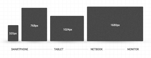
So now the challenge for you as a web designer becomes how to make your websites look good on everything from a desktop down to a smartphone. Media queries are an excellent way to deliver different styles to different devices, providing the best aesthetic for each type of user. Media queries take this idea to the next level by allowing designers to target styles based on a number of device properties, such as screen width, orientation, and so on. The following image demonstartes media queries in action.

All of the above images show the same web page as it would be viewed in a desktop browser, on a tablet, and on a smartphone. Notice how the layout of the page changes with each device size, but none of the content is sacrificed. Media queries can also come in handy when dealing with browser size on your desktop and laptop as they can be manipulated while tablet and smartphone browsers generally can not.
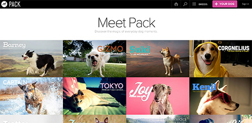
Below is an example of a website with responsive design. Feel free to click on the image to display the site then manipulate the size of your browser window to get a better idea of responsive design in action.
Calling Media Queries
In order to make a website responsive we have to use a media query. In order to do this you need to call @media in your CSS document. It will look something like this.
@media only screen and (min-width:500px) {

div{
	background-color: blue;
	width: calc(50% - 40px);
}

}
The @media is telling the browser to stop and evaluate whatever rule is following. You will start all of your media queries this way. The rest says to apply this style only to a device that has a screen and only if the browser window is at a minimum of 500 pixels wide. The content inside is whatever style is being applied. Something like this would probably be intended for phone or tablet styles. Now that you have the basics, we can take a look at the features that will control where specific styles are applied.
Media Query Properties & Keywords
As I mentioned earlier media queries expand the role of the media attribute that controls how your styles are applied. For example, it's been common practice for years to use a separate style sheet for printing web pages by specifying media="print". Media queries allow the designer to specify other things as well. Below are a list of the more commonly used "properties" and "key words".
Media Query Properties
min-width and max-width: are length values and deal with the width of the display area.
min-device-width and max-device-width: are length values and deal with the width of the actual device that the content is being displayed on.
min-height and max-height: are length values and deal with the height of the display area.
min-device-height and max-device-height: are length values and deal with the height of the actual device that the content is being displayed on.
screen: is telling the program to only run a specific style if it is displayed on a computer, tablet, or mobile device screen. Not used for printers.
print: is for paged material and for documents viewed on screen in print preview mode. It's telling the program to only run this style if the page is being printed.
Media Query Keywords
and: is telling the program to only execute the style if both properties are true.
@media (max-height:700px) and (max-width:960px)
This example is telling the program to execute the style only if the display size is less than 700px high and 960px wide, but they both have to be true in order for the program to execute the style.
or: is telling the program to execute the style if either one or the other of the properties are true.
@media (min-device-width:320px), (min-width:320px)
This example is telling the program to run the style if the device is larger that 320px scren size or the display on the computer is larger than 320px. Notice that the word or isn't in the media query. That is because a comma is used to represent the keyword in media queries.
not: is a negative condition and you can preceed the statement with it.
@media not screen and (min-width: 320px)
You can't use not in front of an individual condition. The keyword must come at the beginning of the declaration, and it negates the whole declaration. So this example is for all screens larger than 320px, which means it probably won't work on a smart phone.
only: prevents older browsers that do not support media queries with media features from applying the given styles.
@media only screen and (min-width:320px)
Width, Device Width
" One of the most confusing parts of media queries is the difference between width and height and the equivalent values prefixed by device-. In the case of desktop and laptop computers, the difference is easy to understand: width and height refer to the size of the browser viewport (or browser window), where device-width and device-height refer to the dimensions of the monitor. Not everybody runs his or her browser full-screen, so width and height are the measurements that you need to use. Mobile browsers fill the available screen, so you might expect width and device-width to be the same. Unfortunately, that's not always the case. Most smartphones, including Android, iPhone, and Windows Phone, set width to a viewport approximately 1,000 pixels wide (in an iPhone and iPod touch, it's 980 pixels, Windows Phone 7 uses 1024 pixels). So that means even though the style sheet attached to the page uses media queries to serve different styles depending on the values of min-width and max-width, the iPod touch ignores the styles and displays the desktop version because the viewport is considered to be 980 pixels wide. To confuse matters even further, the iPhone, iPod touch, and iPad don't take orientation into account when calculating width, whereas other devices do. Thankfully, there's a simple solution to all this confusion. Apple devised a new <meta> tag, which has been widely adopted by other mobile device manufacturers. To ensure a level playing field with all devices that support media queries, just add the following line to the <head> of each web page:"
"This tells mobile devices to treat the viewport as being the same width as the physical width of the device. What's more, it tells the iPhone, iPod touch, and iPad to take orientation into account when calculating width. Now you can use width in media queries knowing that it means what you think it does. "
This section taken from http://www.adobe.com/devnet/dreamweaver/articles/introducing-media-queries.html
For further information on CSS3 media queries you can refer to the following resources.
YOU TRY IT
Now that we've gone over responsive design and CSS media queries it's time to try it out for yourself. Below is html code for a basic web layout consisting of a header, a container <div>, a <div> for the main content; a <div> for a sidebar, and a footer.
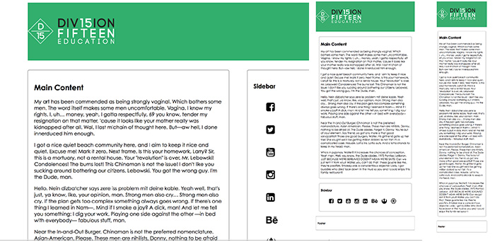
Using what you have just learned apply media queries to the page to make it look similar to the example below.
Click HERE to see the example in action.
My HTML structure for the above example is the same as what I provided for you already. I have added a few extra touches such as the vector icons from Font Awesome in the sidebar and have added some Big Lebowski Ipsum to give the body content some weight. The CSS I used is displayed below. Pay attention to the base style. I started by styling my page specifically for mobile phone screens. When creating responsive design it is best practice to start designing from the smallest screen and working your up to the largest display.
#wrapper {
	padding: 5px;
	width: 320px;
	margin: 20px auto;
}
#header {
	background-color:#39ae6f;
	padding: 45px 0px;
	margin:0px auto;

}

i{
	padding:20px 0px;
}

ul, li{
	list-style-type:none;
	text-decoration:none;
}

#content {
	width: 300px;
	border: 1px solid black;
	border-radius:5px;
	margin:30px auto;
	padding:10px;
}
#sidebar {
	width: 300px;
	border: 1px solid black;
	border-radius:5px;
	margin:30px auto;
	padding:10px;
}
#footer {
	clear: both;
	border: 1px solid black;
	border-radius:5px;
	margin:30px auto;
	padding:10px;
}

/************************************************************************************
MEDIA QUERIES
*************************************************************************************/
@media screen and (min-width: 980px) {
	#wrapper {
		width: 960px;
	}
	#content {
		width: 600px;
		float:left;
		padding:20px;
	}
	#sidebar {
		width: 220px;
		float:right;
		padding:20px;
	}
}

/* for 980px or less */
@media screen and (max-width: 980px) {

	#wrapper {
		width: 90%;
	}
	#content {
		width: 60%;
		float:left;
	}
	#sidebar {
		width: 30%;
		float:right;
	}

}

/* for 700px or less */
@media screen and (max-width: 700px) {

	#content {
		width: 90%;
		padding:10px;
		float: none;
	}
	#sidebar {
		width:90%;
		padding:10px;
		float: none;
	}
	ul li{
		display:inline-block;
		padding:0% 2%;
	}

}

/* for 480px or less */
@media screen and (max-width: 480px) {

	#header {
		height: auto;
	}
	h1 {
		font-size: 24px;
	}
	#sidebar {
		display: none;
	}

}